Below 960 px the case sidebar moves under the entire main column. On a phone, the player, active restrictions, follow-up review and unread updates only appear after the assessment, every evidence excerpt, the notes and the full timeline.
cases/[id]/+page.svelte:283-596 renders the main column (assessment, evidence, notes, timeline) before the sidebar (follow-up, updates, related cases, player, linked actions, restrictions, coverage).
cases/[id]/+page.svelte:750-754 switches to one column below 960 px, keeping that order.
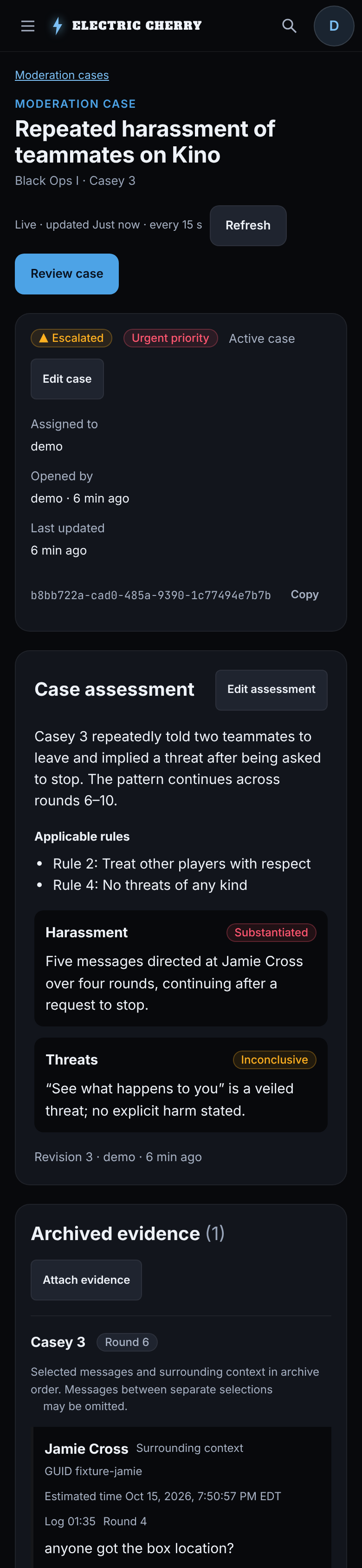
On a 390×844 phone, a case with one ten-line evidence excerpt is 9,024 px tall. The overdue follow-up review starts 7.1 screens down, player identity 8 screens down and the active mute 8.9 screens down. A moderator opening a case on a phone can't see who it's about, whether they're already restricted, or that a review is overdue without scrolling past everything else.
Screenshots
Synthetic preview. Cases, archived chat and a second moderator were added through the moderation API for these screenshots. The after images are mockups.
Before:
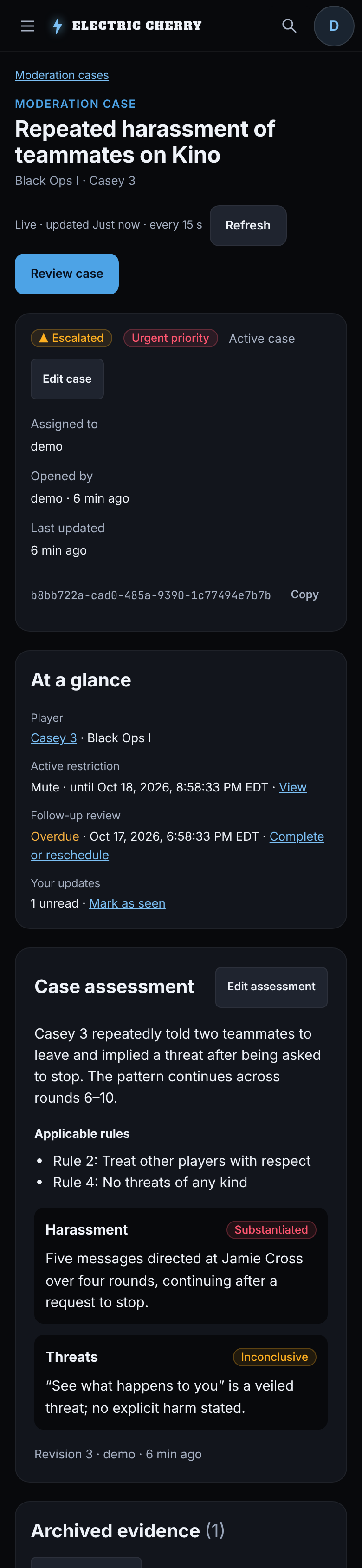
After (mockup):
Fix
On narrow screens, show an "At a glance" panel under the case summary with the player, active restrictions, follow-up state and unread updates, each linking to its full section
Check that on a 390×844 phone the panel is within the first two screens
Below 960 px the case sidebar moves under the entire main column. On a phone, the player, active restrictions, follow-up review and unread updates only appear after the assessment, every evidence excerpt, the notes and the full timeline.
- `cases/[id]/+page.svelte:283-596` renders the main column (assessment, evidence, notes, timeline) before the sidebar (follow-up, updates, related cases, player, linked actions, restrictions, coverage).
- `cases/[id]/+page.svelte:750-754` switches to one column below 960 px, keeping that order.
On a 390×844 phone, a case with one ten-line evidence excerpt is 9,024 px tall. The overdue follow-up review starts 7.1 screens down, player identity 8 screens down and the active mute 8.9 screens down. A moderator opening a case on a phone can't see who it's about, whether they're already restricted, or that a review is overdue without scrolling past everything else.
**Screenshots**
Synthetic preview. Cases, archived chat and a second moderator were added through the moderation API for these screenshots. The after images are mockups.
Before:
After (mockup):
**Fix**
- [ ] On narrow screens, show an "At a glance" panel under the case summary with the player, active restrictions, follow-up state and unread updates, each linking to its full section
- [ ] Check that on a 390×844 phone the panel is within the first two screens
Blocking a user prevents them from interacting with repositories, such as opening or commenting on pull requests or issues. Learn more about blocking a user.


Below 960 px the case sidebar moves under the entire main column. On a phone, the player, active restrictions, follow-up review and unread updates only appear after the assessment, every evidence excerpt, the notes and the full timeline.
cases/[id]/+page.svelte:283-596renders the main column (assessment, evidence, notes, timeline) before the sidebar (follow-up, updates, related cases, player, linked actions, restrictions, coverage).cases/[id]/+page.svelte:750-754switches to one column below 960 px, keeping that order.On a 390×844 phone, a case with one ten-line evidence excerpt is 9,024 px tall. The overdue follow-up review starts 7.1 screens down, player identity 8 screens down and the active mute 8.9 screens down. A moderator opening a case on a phone can't see who it's about, whether they're already restricted, or that a review is overdue without scrolling past everything else.
Screenshots
Synthetic preview. Cases, archived chat and a second moderator were added through the moderation API for these screenshots. The after images are mockups.
Before:

After (mockup):

Fix